
Personal Health Record
Mobile App
TIMELINE
September 2021 - December 2021
GOAL
Design a personal health record mobile app for patients to manage their health care on the go
TOOLS
Figma, Maze
METHODOLOGIES
Paper prototyping, wireframing, high-fidelity prototyping, usability testing
In the course, HF 770: Prototyping and Interaction Design, I designed a personal health record mobile app for an individual project. The project had six user story requirements, including various acceptance criteria, that the prototype would need to satisfy:
-
As a patient I want to manage essential aspects of my Personal Health Record (PHR) using my mobile device so that I can manage my care while I’m on the go.
-
As a patient I want a simple way to pay my medical bills online so that I don’t have to interpret complicated paper bills, write checks, or send payments through the mail.
-
As a patient I want view my blood test results together with my doctor’s feedback so that I can stay up to date on my results and take appropriate action based on my doctor’s feedback.
-
As a patient I want to send and receive secure messages to my care team so that I can coordinate my
care without having to make phone calls for minor requests or deal with long hold times. -
As a patient I want to manage my appointments on my mobile device so that I can set up appointments while I’m on the go.
-
As a patient I want to quickly and easily request and receive refills for my medications so that I can have continuous access to the medications without having to call my doctor’s office or travel to my preferred pharmacy to request refills.
Project Journey
Throughout the course of the project, I created paper prototypes, wireframes, low-fidelity prototypes, and high-fidelity prototypes using Figma. I conducted usability tests of the prototype with my fellow classmates and professor using Maze. I also annotated many of my designs to clearly communicate the functionality or purpose of specific elements to the class.
Paper Prototyping
After learning about the project requirements, I paper sketched designs to satisfy the requirements. By using this method early in the design process, I could quickly test ideas and easily make changes to the sketches.


The video below shows a demo of the flow for scheduling an appointment.
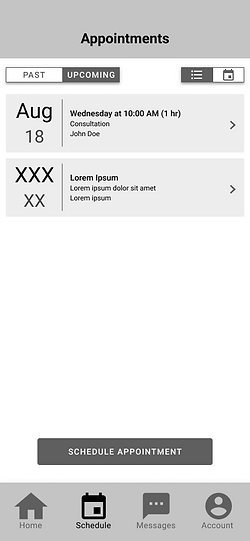
Wireframing
Once I finished my paper sketches, I moved on to wireframing my designs on Figma. This included using basic shapes, symbols provided by Figma plugins, placeholder text, and a monochrome color theme.


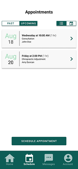
High-Fidelity Prototyping
After I completed the wireframes, I created high-fidelity designs of the app. During this process, I added color to elements and replaced most of the placeholder text.


Usability Testing
Throughout the wireframing and prototyping process, I conducted usability tests using Maze. On this testing platform, my classmates and professor tried out my app while completing Mission tasks. After completing a series of tasks, they provided me feedback on their experience with the app. One feedback that I received was increasing the size of buttons for easier reach by both left- and right-handed users. Another piece of advice was providing information (e.g., in subtext or a clickable ⓘ icon) about a feature in the app that some users might not notice was interactive.

Outcome
At the end of semester, I submitted the following deliverables to the professor:
-
PowerPoint presentation (pdf format)
The video below is my final presentation, which includes a demo of the prototype.
Reflection
Throughout the course, I practiced many design methods, including paper prototyping, wireframing, and high fidelity prototyping. I became more experienced with using Figma, and I learned how to use a new tool, Maze, to create usability tests. I also learned how to apply various UX design concepts to my project; four that particularly stood out to me are the following:
-
Thumb Zone: Increase width of buttons for easier reach with both left and right handed users
-
Colorblindness: Design a colorblind-friendly palette for accessibility
-
Button Placement: Place the button with the most “destructive” option farthest from reach to prevent errors
-
Language: Consider the wording of button labels, popup messages, and other elements and ensure they clearly communicate its message to the user